
 Argentina
 Bolivia
 Chile
 Colombia
 Ecuador
 Guyana
 French Guiana
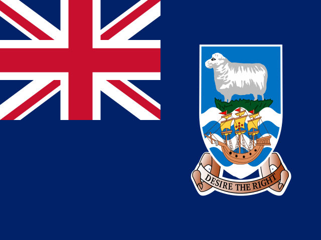 Falkland Islands (Malvinas)
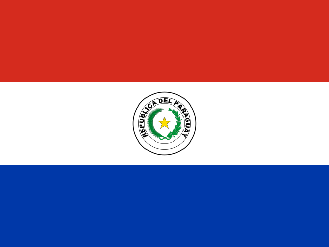 Paraguay
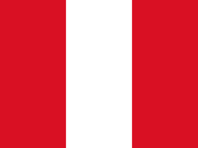 Peru
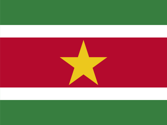 Suriname
 Uruguay
 Venezuela
 Germany
 Austria
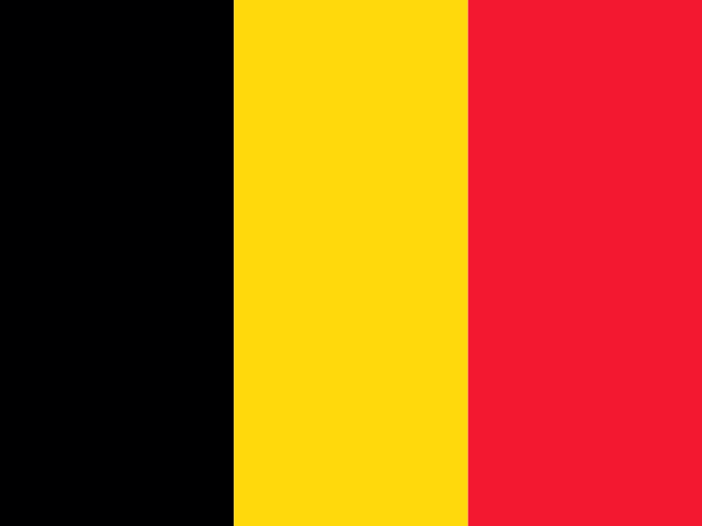 Belgium
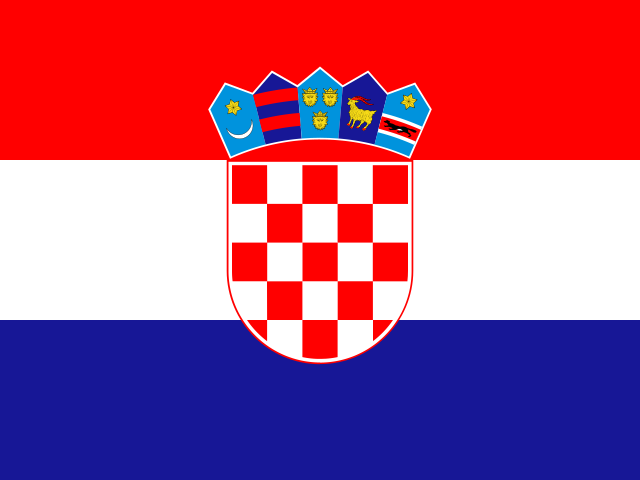 Croatia
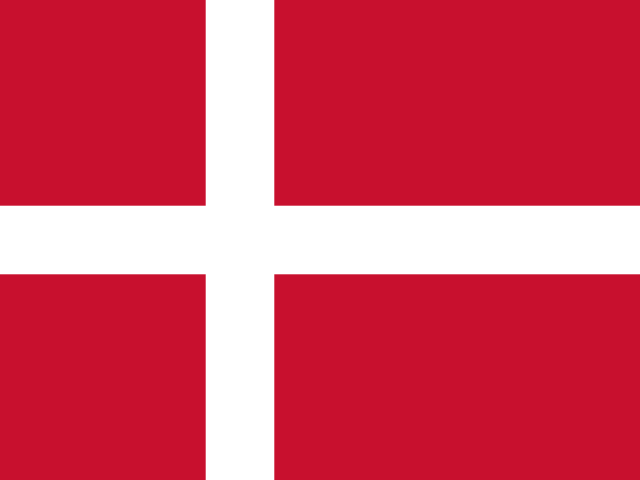 Denmark
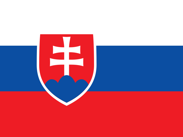 Slovakia
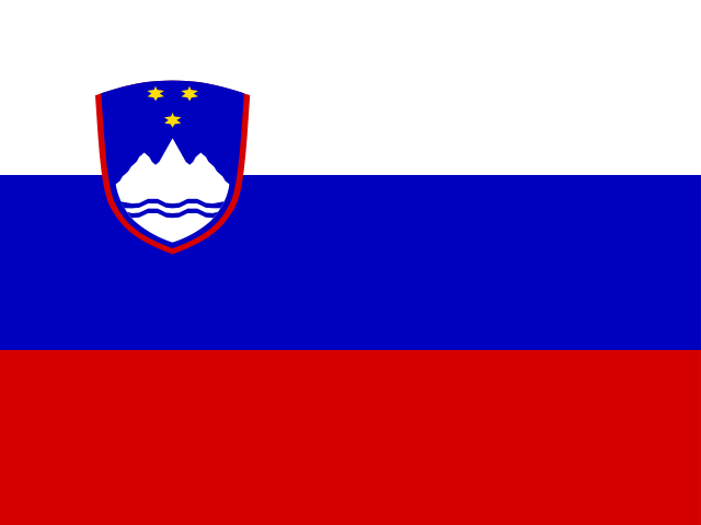 Slovenia
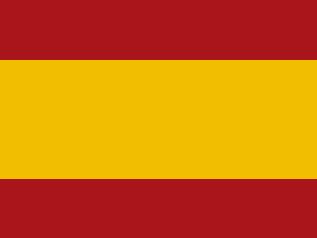 Spain
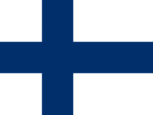 Finland
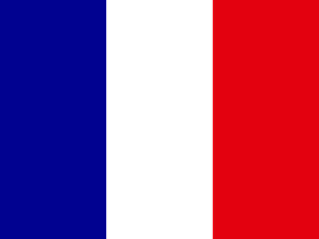 France
 Greece
 the Netherlands
 Hungary
 Ireland
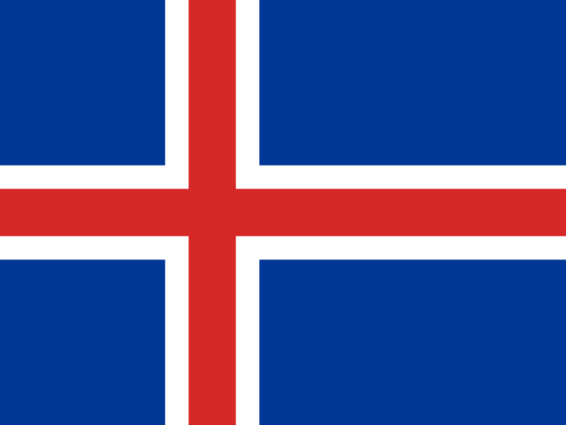 Iceland
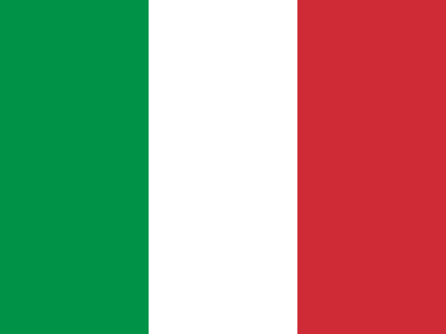 Italy
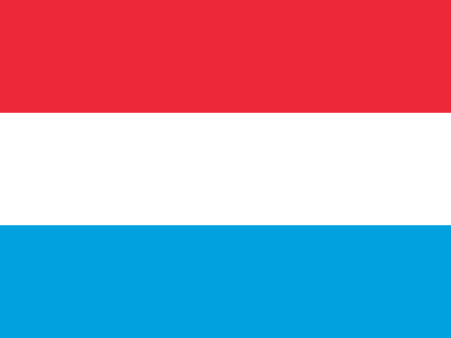 Luxembourg
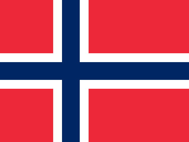 Norway
 Poland
 Portugal
 the United Kingdom
 the Czech Republic
 Sweden
 Switzerland
 Turkey
 Canada
 the United States
 Mexico
 the Dominican Republic
 South Africa
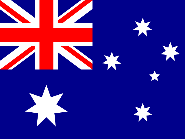 Australia
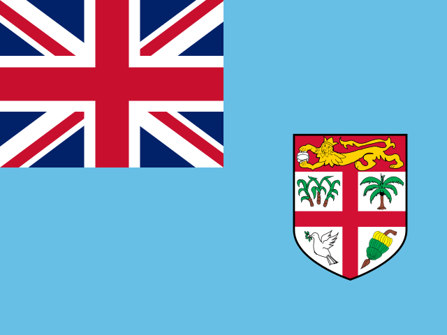 Fiji
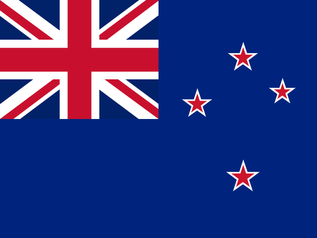 New Zealand
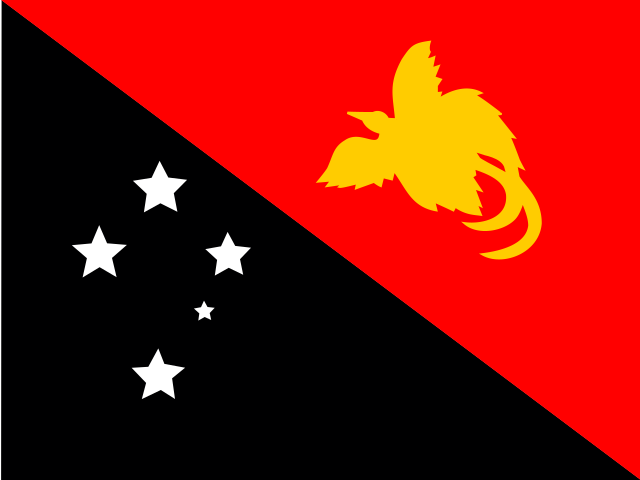 Papua New Guinea
Illustrative images. The pictures in this guide are illustrations based on the real place, not photographs, and may differ from it.

Actual size of countries
On the most common world map, Greenland looks the size of Africa. Choose a country, drag it across the map and see its true size next to others.
Loading the map…
Tap a country and drag the colored copy across the map
Countries on the map
No country chosen yet. Tap a country on the map or use the search.
Country outlines: Natural Earth (public domain), simplified. Areas are approximate, calculated from the outlines themselves.
How to use the map
Tap or click a country: a colored copy of it detaches from the map. Drag the copy to another place and compare it with the surrounding countries. To choose by name, use the search above the map.
Near the equator, the copy shrinks; near the poles, it grows. The country’s area stays the same: what changes is the map’s distortion at each latitude.
Several countries can remain on the map at the same time, each in a different color. To zoom in, use the + and − buttons or the mouse wheel; to move the map, drag the background.
Why the map deceives
The Mercator projection was created by the Flemish cartographer Gerardus Mercator in 1569 for navigation. In it, a course of constant bearing appears as a straight line, which made it easier to plot a ship’s route with a compass.
To achieve that, the map preserves angles and the shapes of places seen up close, but it stretches everything the farther it is from the equator. At 60 degrees latitude, near Oslo or Anchorage, distances appear twice as large and areas about four times larger. The poles don’t even fit on the map: they would be stretched without limit.
Many online maps use a variant of this projection because it allows you to zoom in on any place without distorting streets and city blocks. That’s why, on the world map most people know, countries near the equator look smaller than they really are compared with those near the far north and far south.
Comparisons that surprise
Greenland, at about 2.2 million km², looks the size of Africa on the Mercator map. Africa has about 30 million km²: roughly 14 Greenlands would fit inside it.
Russia is the largest country in the world, at about 17.1 million km², but Africa is almost twice that area.
Alaska appears larger than Mexico, but it is about 1.7 million km², compared with nearly 2 million km² for Mexico.
Antarctica appears as a huge strip at the bottom of the map. On Earth it is about 14 million km², less than half the area of Africa.
Is there a distortion-free map?
Not on paper or a flat screen. Projecting the surface of a sphere onto a plane always distorts something: areas, shapes, distances or directions. Each projection chooses what to preserve.
Equal-area projections, like Gall-Peters, show countries at their correct size but squash and stretch shapes. Others, like Robinson and Winkel Tripel, distribute the errors so the world map looks more balanced. Only the globe shows everything in true proportion.
Frequently asked questions
Why does Greenland look so big on the map?
Because the Mercator projection stretches areas the farther they are from the equator, and Greenland is very far north. It is about 2.2 million km², roughly 14 times smaller than Africa, but on the map the two appear similar in size.
Which is the largest country in the world?
Russia, at about 17.1 million km². Next come Canada, the United States, China and Brazil. The order between the United States and China varies depending on whether a source counts inland and coastal waters.
Why does a country change shape when it’s dragged?
Because Mercator distortion changes with latitude: the part of the country closer to the pole is more stretched than the part closer to the equator. When you move the copy to another latitude, that difference changes and the shape changes with it.
Are the areas shown on the map exact?
They are approximate, calculated from a simplified outline of each country. They can differ slightly from official figures, which sometimes include lakes, rivers and coastal waters.
Is there a distortion-free world map?
Not on a plane. Every projection distorts areas, shapes, distances or directions. Equal-area projections show the correct sizes but distort shapes; only the globe shows everything in proportion.
How to use the map on a phone?
Tap a country to detach the copy and drag it with one finger. To move the map, drag the background; to zoom, use the + and − buttons or spread two fingers on the screen.
The true size of each country
- Afghanistan
- Albania
- Algeria
- American Samoa
- Andorra
- Angola
- Anguilla
- Antarctica
- Antigua and Barbuda
- Argentina
- Armenia
- Aruba
- Australia
- Austria
- Azerbaijan
- Bahrain
- Bangladesh
- Barbados
- Belarus
- Belgium
- Belize
- Benin
- Bermuda
- Bhutan
- Bolivia
- Bosnia and Herzegovina
- Botswana
- Brazil
- British Indian Ocean Territory
- Brunei
- Bulgaria
- Burkina Faso
- Burundi
- Cambodia
- Cameroon
- Canada
- Cape Verde
- Chad
- Chile
- China
- Colombia
- Costa Rica
- Côte d'Ivoire
- Croatia
- Cuba
- Curaçao
- Cyprus
- Denmark
- Djibouti
- Dominica
- Ecuador
- Egypt
- El Salvador
- Equatorial Guinea
- Eritrea
- Estonia
- Eswatini
- Ethiopia
- Falkland Islands (Malvinas)
- Fiji
- Finland
- France
- French Guiana
- French Polynesia
- French Southern Territories
- Gabon
- Georgia
- Germany
- Ghana
- Greece
- Greenland
- Grenada
- Guam
- Guatemala
- Guernsey
- Guinea
- Guinea-Bissau
- Guyana
- Haiti
- Heard Island and McDonald Islands
- Honduras
- Hong Kong
- Hungary
- Iceland
- India
- Indonesia
- Iran
- Iraq
- Ireland
- Israel
- Italy
- Jamaica
- Japan
- Jersey
- Jordan
- Kazakhstan
- Kenya
- Kiribati
- Kosovo
- Kuwait
- Kyrgyzstan
- Laos
- Latvia
- Lebanon
- Lesotho
- Liberia
- Libya
- Liechtenstein
- Lithuania
- Luxembourg
- Macao
- Madagascar
- Malawi
- Malaysia
- Mali
- Malta
- Mauritania
- Mauritius
- Mexico
- Micronesia
- Moldova
- Monaco
- Mongolia
- Montenegro
- Montserrat
- Morocco
- Mozambique
- Myanmar
- Namibia
- Nauru
- Nepal
- New Caledonia
- New Zealand
- Nicaragua
- Niger
- Nigeria
- Niue
- Norfolk Island
- North Korea
- North Macedonia
- Norway
- Oman
- Pakistan
- Palau
- Palestine
- Panama
- Papua New Guinea
- Paraguay
- Peru
- Poland
- Portugal
- Puerto Rico
- Qatar
- Romania
- Russia
- Rwanda
- Saint Barthélemy
- Saint Helena
- Saint Kitts and Nevis
- Saint Lucia
- Saint Martin
- Saint Pierre and Miquelon
- Saint Vincent and the Grenadines
- Samoa
- San Marino
- São Tomé and Príncipe
- Saudi Arabia
- Senegal
- Serbia
- Seychelles
- Sierra Leone
- Singapore
- Sint Maarten
- Slovakia
- Slovenia
- Somalia
- South Africa
- South Georgia and the South Sandwich Islands
- South Korea
- South Sudan
- Spain
- Sri Lanka
- Sudan
- Suriname
- Sweden
- Switzerland
- Syria
- Taiwan
- Tajikistan
- Tanzania
- Thailand
- the Åland Islands
- the Bahamas
- the British Virgin Islands
- the Cayman Islands
- the Central African Republic
- the Comoros
- the Cook Islands
- the Czech Republic
- the Democratic Republic of the Congo
- the Dominican Republic
- the Faroe Islands
- the Gambia
- the Isle of Man
- the Maldives
- the Marshall Islands
- the Netherlands
- the Northern Mariana Islands
- the Philippines
- the Pitcairn Islands
- the Republic of the Congo
- the Solomon Islands
- the Turks and Caicos Islands
- the U.S. Virgin Islands
- the United Arab Emirates
- the United Kingdom
- the United States
- Timor-Leste
- Togo
- Tonga
- Trinidad and Tobago
- Tunisia
- Turkey
- Turkmenistan
- Uganda
- Ukraine
- Uruguay
- Uzbekistan
- Vanuatu
- Vatican City
- Venezuela
- Vietnam
- Wallis and Futuna
- Western Sahara
- Yemen
- Zambia
- Zimbabwe